The problem was not how it looked. Every element appeared polished. But patients could not find service information quickly. The booking system required four clicks through confusing pages. On mobile phones, half the buttons did not work properly. Beautiful design. Terrible function.
Most UAE businesses approach website designing with the wrong priorities. They chase aesthetics while ignoring elements that convert visitors into paying customers. A gorgeous website that generates zero leads is an expensive mistake, not an asset. C Zone Star, we see this pattern across industries. Companies spend heavily on visual polish while skipping the structural elements that actually drive business growth.
The gap between websites that generate revenue and those that waste traffic comes down to specific design elements. These are not opinions or preferences. They either increase conversions or they do not. Understanding which elements matter separates profitable online presence from digital decoration.
Navigation: The 3-Second Decision Point
Visitors decide to stay or leave within seconds. Navigation clarity drives that decision more than any other single factor.
Confusing menus kill conversions immediately. A fitness center had nine menu items, each opening dropdown submenus with 15 more choices. Potential members faced overwhelming options. Class schedules? Membership pricing? Trial sessions? Nobody could find anything quickly.
They simplified to five clear items: Classes, Memberships, Trainers, Locations, Join Now. Membership inquiries jumped 51% because people could navigate without thinking.
Navigation labels should be obvious, never clever. Creative wording confuses visitors. A software company used “Solutions” as a menu label. Nobody knew what that meant. When they changed it to “Products” and “Services,” engagement increased because visitors understood immediately what they would find.
Sticky navigation keeps options visible while scrolling. Someone reading your service descriptions who decides to contact you should not scroll back to the top. A law firm added persistent navigation. Contact form submissions increased 39% because the contact button stayed accessible.
Mobile navigation needs different strategy entirely. Hamburger menus work when properly labeled. A restaurant saw 23% more online orders after adding “MENU” text next to their hamburger icon. The most critical pages should be immediately visible, not hidden in collapsed menus.
Mobile Responsiveness: Beyond Basic Compatibility
Your website probably displays on phones. That does not mean it functions properly.
An accounting firm had a technically mobile-responsive site. It loaded on smartphones. But text was unreadable without zooming. Buttons were too small to tap accurately. Contact forms were torture on phone keyboards. Service descriptions cut off mid-sentence.
True mobile optimization goes beyond technical responsiveness. It requires deliberate design for touch interfaces, smaller screens, and mobile usage patterns.
Touch targets must be large enough for fingers. A medical laboratory increased their test booking conversions 42% simply by making their “Book Test” button bigger. Tiny buttons cause mis-taps and frustration. Apple recommends 44×44 pixels minimum for any tappable element.
Text size directly impacts usability. Anything below 16 pixels forces zooming on phones. A training academy increased their course enrollment 34% after enlarging mobile text. Visitors could read course descriptions without manually zooming every paragraph.
Forms need mobile-specific optimization. Email fields should trigger keyboards with @ symbols easily accessible. Phone fields should show numeric keypads. Date fields should offer calendar pickers. A recruitment agency reduced application abandonment 47% by implementing proper mobile form fields.
Images must load quickly on mobile networks. A 3MB hero image that displays instantly on office WiFi takes 20 seconds on mobile data. A furniture retailer compressed images without visible quality loss. Mobile bounce rate dropped from 68% to 31%.
Load Speed: The Invisible Revenue Destroyer
Website speed directly determines revenue. Research consistently shows over half of mobile visitors abandon sites taking more than 3 seconds to load.
A photography studio had incredible portfolio images. High-resolution photos showcasing their work beautifully. Their homepage took 9 seconds to load. Potential clients never saw the portfolio because they left before it loaded.
They optimized images and implemented proper caching. Load time dropped to 1.8 seconds. Booking inquiries increased 64% with identical traffic volume. The only change was speed.
Image optimization delivers the biggest speed improvements. A bakery reduced image file sizes by 70% without noticeable quality loss. Their menu page went from 6-second load to under 2 seconds. Online orders increased immediately.
Code efficiency matters. Removing unused plugins and scripts keeps pages lean. A consulting firm eliminated five plugins they were not actively using. Page load improved from 4.7 seconds to 2.1 seconds. Lead form completions jumped 41%.
Hosting quality affects everything. Cheap shared hosting saves AED 40 monthly while potentially costing thousands in lost business. An interior design studio moved from budget hosting to quality servers. Load time dropped from 5.9 seconds to 1.6 seconds. Project inquiry volume doubled within three weeks.
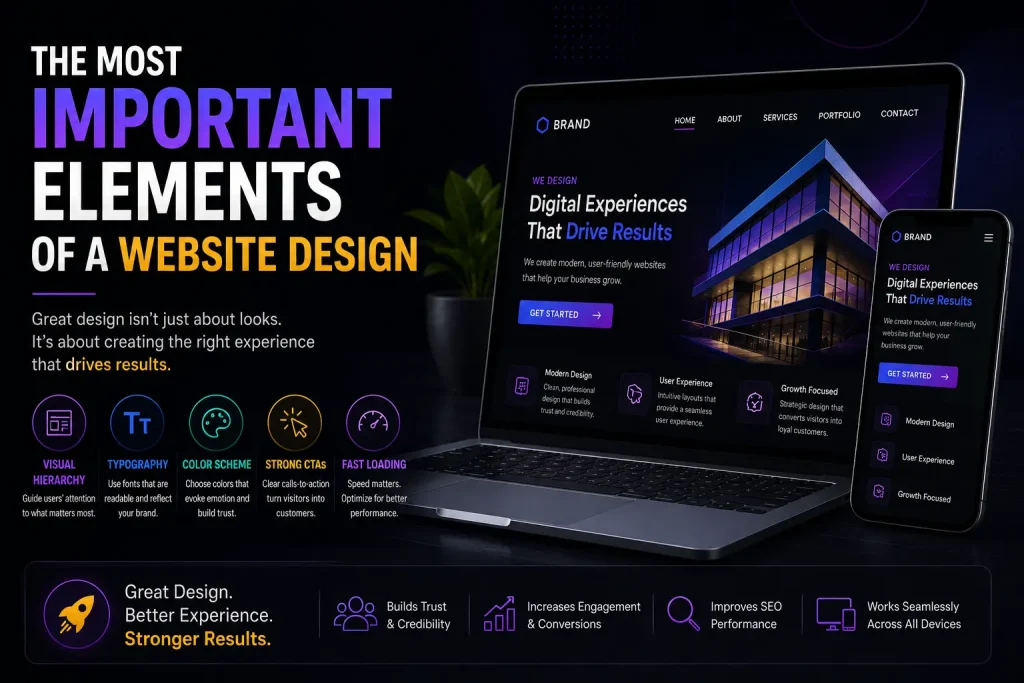
Visual Hierarchy: Directing Attention Deliberately
Visitors scan websites, they do not read them. Visual hierarchy determines what gets noticed.
Size, color, contrast, and positioning guide eyes to important information. A language school had uniform text sizing throughout their website. Course benefits got the same visual weight as footer disclaimers. Nothing stood out.
They restructured with clear hierarchy. Large headlines for key value propositions. Medium subheadings for supporting points. Smaller body text for details. CTA buttons in contrasting colors. Course registrations increased 38% because visitors followed the intended information flow.
Whitespace functions as design element, not wasted space. Cramming everything together creates overwhelming pages. A financial advisory firm added generous spacing between sections. Time on site increased 27% because visitors could focus on individual services without visual noise.
Color directs attention powerfully. CTA buttons must contrast with surrounding elements. If your site uses blue everywhere, blue buttons disappear. A healthcare clinic changed their appointment button from matching gray to bright orange. Clicks increased 62%.
Typography affects both readability and credibility. Decorative fonts reduce comprehension. A luxury watch retailer switched from script fonts to clean sans-serif. Product page engagement increased because descriptions became actually readable.
Trust Signals: Converting Skeptical Visitors
UAE business culture demands credibility. Trust signals determine whether visitors believe your capabilities.
Security indicators are non-negotiable. SSL certificates showing the padlock icon and “https” URL are minimum requirements. An ecommerce store selling electronics lost 40% of checkout attempts until they fixed their SSL certificate. Customers will not enter payment details on unsecured sites.
Client logos establish credibility through association. If recognized companies trust you, new visitors feel safer. A digital marketing agency added client logos to their homepage. Conversion rate improved 33% because social proof reduced decision anxiety.
Testimonials work when they feel genuine. Generic praise adds zero value. Specific testimonials with full names, photos, and concrete results build real credibility. A personal training studio replaced vague reviews with detailed client transformation stories including photos and specific achievements. Membership signups increased 44%.
Professional imagery signals quality. Stock photos of fake offices and staged handshakes feel inauthentic. Real photos of actual team members, workspace, and work in progress build trust. An architecture firm replaced stock images with photos of their actual projects and team. Client inquiries increased 36% because the business felt real.
Certifications and awards belong prominently displayed. If you have industry credentials, show them. A cybersecurity company added security certifications to their homepage. Enterprise inquiries increased 52% because third-party validation carried weight generic claims could not.
Calls to Action: The Element Most Websites Botch
Every page needs a clear next step. Most websites make visitors guess what to do.
A plumbing services company had detailed service descriptions but no obvious CTAs. Visitors read about pipe repair and water heater installation, then left because they did not know how to book service. Adding specific CTAs like “Schedule Emergency Service,” “Get Free Estimate,” and “Call Now” increased service calls 71%.
CTA placement determines whether visitors see options. Above-the-fold placement ensures immediate visibility. But CTAs also belong at natural decision points throughout content. After explaining benefits of teeth whitening, a dental clinic placed a “Book Whitening Consultation” button. Conversions from that service page tripled.
CTA copy drives action. “Submit” sounds bureaucratic. “Get Your Free Consultation” tells visitors exactly what happens and emphasizes value. “Click Here” wastes opportunity. “See Our Portfolio” gives specific reason to click. A photography studio changed CTAs from generic to specific. Click-through rate increased 56%.
Button design affects clicks measurably. Size matters. Invisible buttons get ignored. Enormous buttons look unprofessional. A tutoring center tested button sizes and found 15% conversion improvement with medium-large buttons versus their previous small ones.
Multiple CTAs serve different visitor readiness levels. Primary CTA for high-intent visitors ready to buy. Secondary CTA for those needing more information. A pest control company offers “Book Treatment Now” and “Learn About Our Methods.” This captures both immediate buyers and researchers.
Contact Accessibility: Removing Purchase Barriers
Making contact difficult costs business daily. Visitors should never hunt for ways to reach you.
Phone numbers belong in headers on every page. Someone ready to call should not navigate to contact pages first. A veterinary clinic added click-to-call phone number to their header. Emergency calls increased 48% because people could reach them immediately.
Contact forms need simplicity. Asking for excessive information before people can ask questions kills completions. A landscaping company reduced their form from 11 fields to 4 essential ones. Submissions increased 73%.
Multiple contact options serve different preferences. Some prefer calls. Others want email. Many use WhatsApp. An electronics repair shop added WhatsApp contact. Service requests increased 41% because customers could message photos of broken devices directly.
Contact pages need more than forms. Physical address builds credibility. Google Maps helps visitors find you. Operating hours set expectations. A car detailing service added detailed location information including parking instructions. Walk-in customers from website increased 29%.
Response expectations prevent uncertainty. If your form promises 2-hour response time, visitors know what to expect. Auto-confirmation emails provide instant reassurance. A wedding planning company implemented immediate auto-responses. Inquiry follow-through improved because couples knew their message was received.
Content Structure: Making Information Digestible
Text walls get skipped. Structure determines whether visitors engage with content.
Short paragraphs improve readability. Three to four sentences per paragraph keeps content scannable. A business coaching website had dense 200-word paragraphs. Nobody read them. Breaking content into shorter chunks increased time on page by 52%.
Subheadings guide scanning. Visitors should understand page content by reading only headings. A management consulting firm restructured service pages with descriptive subheadings. Engagement improved because visitors could jump directly to relevant sections.
Bullet points work for lists. Benefits, features, process steps all become clearer in bulleted format. An insurance broker converted paragraph-format coverage details into bullets. Quote request rate increased 38% because information became accessible.
Bold text highlights key information. Strategic bolding lets scanners catch important points. A tech support company bolded critical information in troubleshooting guides. Support ticket volume decreased because people found answers without needing to contact support.
Strategic use of visuals breaks up text. Relevant images, diagrams, and infographics make content less intimidating. A nutrition consultant added meal plan visuals to service descriptions. Program enrollment increased because visitors could visualize what they would receive.
The Elements That Actually Generate Business
Successful websites in UAE share common characteristics regardless of industry. Clear navigation that makes information findable. Mobile optimization that actually works on phones. Load speed under 3 seconds. Visual hierarchy guiding attention deliberately. Trust signals building credibility. Obvious calls to action. Accessible contact options.
These elements are not theoretical. They directly impact whether your website generates revenue or wastes the traffic your digital marketing efforts drive to it.
Most businesses need help implementing these elements properly. This is why professional UI/UX design matters. It is why strategic search engine optimization goes beyond keywords. It is why platforms like WordPress website solution, and comprehensive ecommerce solution work when implemented correctly.
Visual consistency through professional graphic design reinforces brand credibility. Integration with social media marketing, creates cohesive customer experience across channels.
Start by auditing your current website against these elements. Which are you missing? Which need improvement? Prioritize changes that directly impact conversion. Navigation clarity and mobile optimization typically deliver fastest returns. Speed optimization removes invisible barriers. Trust signals reduce purchase hesitation.
Test changes systematically. Implement one improvement, measure impact, then move to the next. A manufacturing company increased leads 127% over six months by methodically improving each element rather than attempting complete redesign.
Your website either supports business growth or prevents it. The elements outlined here determine which category you fall into. Implementation quality separates websites that generate consistent business from expensive digital brochures that sit unused.
Frequently Ask Questions
Q 1: What are the most important elements of a business website?
A: The most critical elements are intuitive navigation allowing visitors to find information quickly, mobile optimization that actually works on phones, page load speed under 3 seconds, clear visual hierarchy directing attention to important content, trust signals like client logos and testimonials building credibility, obvious calls to action telling visitors what to do next, and accessible contact options making it easy to reach you. These elements directly impact whether visitors convert into customers. A Dubai-based service company increased leads 64% by fixing just their navigation clarity and mobile experience.
Q 2: Why does website load speed matter for UAE businesses?
A: Load speed directly affects conversion rates and revenue. Research shows 53% of mobile visitors abandon sites taking over 3 seconds to load. In UAE where mobile traffic dominates, slow sites lose over half their potential customers before content even displays. Google also uses speed as ranking factor, meaning slow sites rank lower in search results. One Abu Dhabi retailer reduced load time from 7 seconds to 2 seconds and saw 58% revenue increase with identical traffic volume. Speed optimization is not optional for competitive markets.
Q 3: How important is mobile optimization for websites in Dubai and UAE?
A: Mobile optimization is critical since over 75% of web traffic in UAE comes from smartphones. Having a mobile-responsive site is not enough. You need properly sized touch targets, readable text without zooming, optimized images for mobile networks, and forms designed for phone keyboards. A Sharjah-based training academy increased mobile conversions 47% by implementing true mobile optimization beyond basic responsiveness. Mobile-first design is essential for UAE markets where phone usage dominates desktop.
Q 4: What trust signals should UAE business websites include?
A: Essential trust signals include SSL certificates showing security, client logos from recognized companies, specific testimonials with real names and photos, professional imagery of actual team and work, relevant certifications and awards, clear contact information including physical address, and transparent pricing where applicable. These elements build credibility in UAE business culture where trust heavily influences purchasing decisions. A professional services firm increased conversions 41% simply by adding client logos and detailed testimonials to their homepage.
Q 6: How can I improve my website conversion rate?
A: Conversion improvement comes from optimizing specific elements. Simplify navigation to 5-7 clear menu items. Ensure mobile functionality beyond just responsiveness. Reduce page load to under 3 seconds. Add clear, specific calls to action at decision points. Display trust signals prominently. Make contact options easily accessible. Simplify forms to essential fields only. Use visual hierarchy to guide attention. Test changes systematically and measure results. A logistics company in Dubai increased conversions 83% over four months by methodically optimizing these elements one at a time.